'b' provide sales and marketing solutions for hotels and destination management companies.
As part of Fridge's rebrand work for 'b', we also designed and built their website.
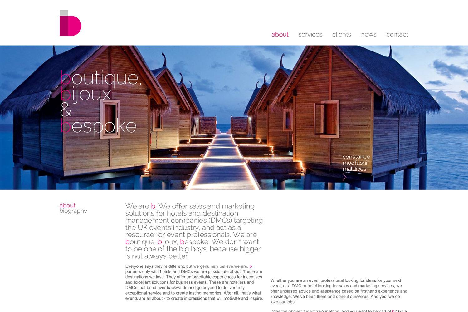
Making use of the stunning photography allowed us to keep imagery large with a modern and clean design. Text areas are playfully placed within the grid structure to allow for a more engaging read.
Customised location illustration logos are used to give each client it's own distinctive feel without losing the 'b' identity.
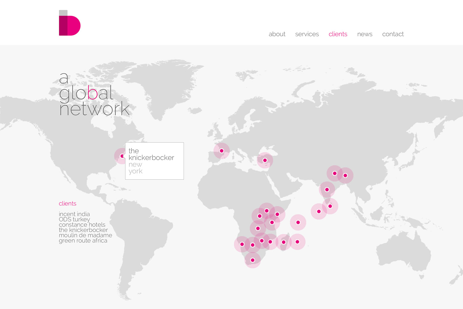
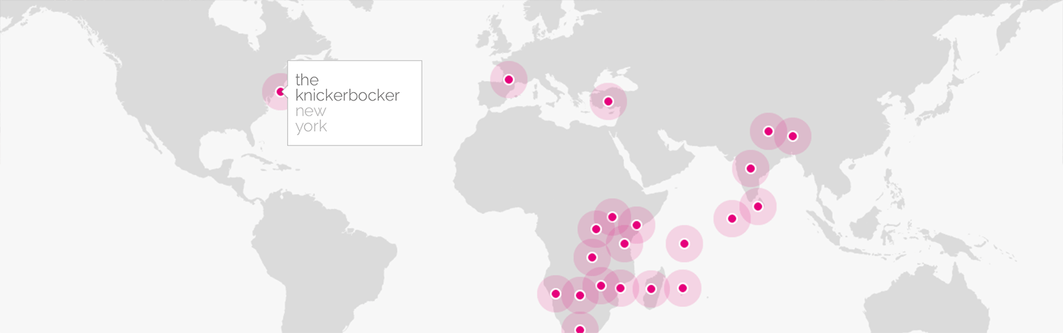
Features such as the full bleed large home page slideshow, world map of locations and Twitter integrations ensure the website offers more than static text pages to keep the readers engaged.
The website design and build was part of Fridge's branding work, which can be viewed here ›